Monday, November 23, 2009

Beautiful People: Propaganda Ads.

Fashion Ad 1940
Fashion Ad

This 1940 advertisement uses an idealized woman to portray the message of buying these clothes will make you like her. She looks fashionable and professional for the time period.

The more modern Dolce & Gabbana advertisement portrays multiple messages, one being if you buy their products and clothes you can be seductive (female) or dominant and sexy (male).


Revlon Ad 1952
Revlon Ad

The 1952 Revlon advertisement depicts a beautiful and thin ideal woman at the time with bright pink lips to make her look glamorous and attractive to the opposite sex (hence the smiling man in the top left corner). This advertisement leads you to believe if you buy this product you can be like her.

The newer Revlon advertisement also makes this woman look glamorous, but in a more sexual manner. The focus is supposed to be on the eyes because they are selling eye makeup (extreme darks), but her full lips add to this sexual intinsity even though the lips are a nutural color. The eyes send off a seductive vibe which tells the consumer if you buy this product you can be glamorous and seductive too.
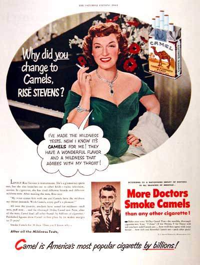


Cig Ad 1951
Cig Ad

The modern cigarette advertisment and the cigarette advertisement from 1951 both display the message if yuo smoke their cigarettes you will be happier and have a good time. The older ad even displays the message "more doctors smoke Camels" while the newer ads are required to post a surgeon generals warning.

Wednesday, November 4, 2009

Compare & Contrast


Jules Cheret: Art Nouveau poster vs Alton Kelley/Mouse: Psychedelic Art “Five men in a boat” August 1966

These two images are similar in that they both use a circular form to help focus the viewers attention to that surface area and keep the viewers eye moving. The words in both pieces vary from small to largeto help keep visual balance. The colors used in both posters are eye catching, however into the psychedelic era brighter colors and larger color pallets were used. Both of the posters are very bold, but in different manners.


Alphonse Mucha: Art Nouveau poster vs. Rick Griffin: Psychedelic Art The Human Be In 1967

These two images have a similar mushroom shape in their imagery. The Art Nouveau's is more pronounced, however The Human Be In also uses a similar shape created by the words "Powwow" and the horse imagery. These two posters also focus on using only 2 to 3 strong contrasting colors. The font used in both of these images is also very decorative.


Leonetto Capiello : Art Nouveau poster vs. John Van Hamersveld: Psychedelic Art Shrine Auditorium 1968 promotional poster

These two posters are similar in that they both use a singular visual object for focus. There is a minimal color pallet containing strong contrasting colors which are used to capture and hold your attention.

Monday, November 2, 2009

Koloman Moser

Koloman Moser (March 1868- October 1918)
Venus in the Grotto (1915)

Moser was an Austrian artist apart of the Vienna Secession movement and co-founder of Wiener Werkstatte. His work was influencial on 20th century graphic artists. Moser worked not only in graphics but also created works in multiple mediums and catagories. These works including jewelry, functional objects (i.e. furniture and architecture), and tapestries. Moser's style derived mostly from classical Greek and Roman art and architecture, using clean lines and repetitive motifs.
information
image

Monday, October 26, 2009

Russian Revolutionary: Dmitri Moor

Dmitri Moor
Russian Revolutionary

"For the Death of World Imperialism"
1920


"Have you Volunteered for the Red Army?"
1920


"Help"
1921

These examples characterize the movement through simple yet bold shapes and colors.


Stylistic devices that characterize this designer in particular are strong diagonals and strong horizontal or vertical lines created by the focal image.

Psychedelic Poster Art vs. Art Nouveau

Alphonse Mucha: Art Nouveau poster image
Leonetto Capiello : Art Nouveau poster image
Jules Cheret: Art Nouveau poster image

Stanley Mouse/Kelley: Avalon Ballroom poster 1966 Mouse images

John Van Hamersveld: Johnny Face image

John Van Hamersveld: Shrine Auditorium 1968 promotional poster image

John Van Hamersveld: Cream 2005 reunion poster image

Rick Griffin: Flying Eyeball image

Rick Griifin/Kelley/Mouse: Trip or Freak 1967 image

Rick Griffin: The Human Be In 1967
Victor Moscoso: Big Borother & the Holding Co. image

Victor Moscoso: Grateful Dead at the Fillmore late 60s/early 70s image

Victor Moscoso: Miller Blues Band poster January 1967 image

Alton Kelley/Mouse: Big Brother and the Holding Company poster October 1966

Alton Kelley/Mouse: Grateful Dead Poster September 1966


Alton Kelley/Mouse: “Five men in a boat” August 1966

Alton Kelley images

Monday, October 19, 2009

TC5


image link
The Crazy Five is one of the most well known graffiti groups of the 1970s. In an interview vice president of the crew, Aevon, stated that their crew was one of the last crews to emphasize letter structure. The crew was well known for top to bottom and whole cars. The original members of the crew were DEATH, BLADE, VAMM, CRACHEE, and TULL 13.

info link
info link

Wim Crouwel

image link

Wim Crouwel, born 1928, is a Dutch graphic designer and typographer. In 1967 Crouwel developed the typeface called New Alphabet. This typeface only contains horizontal and vertical strokes.

info link

Egon Schiele

image link

Egon Schiele (12 June 1890 – 31 October 1918) was an Austrian painter. Schiele is recognized for his many portraits he did throughout his lifetime and the intensisty of his work. He depicted twisted body forms often through expressive line in his work. Schiele has been recognized in the Expressionism and Art Nouveau movement. A good example of his work would be Sitzender weiblicher Akt of 1914.

website link

Milton Glaser


link

Milton Glaser, born June 26, 1929, is a famous graphic designer. His most well known work is the "I love New York" logo. This logo has been used for decades. It has been imitated and altered all over the world. Milton Glaser's work has had a major influence and impact on contemporary illustration and design.

website link

Wednesday, October 7, 2009

Leonetto Capiello's Contratto poster


Leonetto Capiello was an Italian poster designer (1875-1942). He is often referred to as the father in modern poster designing because of his innovation in poster design. He was the first poster artist to use bold black backgrounds. This black background contrasted with his images and lettering to help the image visually pop out. This particular poster demonstrates Capiello's style well. The image and lettering are clear, bold, and easy to understand. I particularly enjoy the drastic contrast he creates by using black backgrounds.

info link: http://en.wikipedia.org/wiki/Leonetto_Cappiello

Neville Brody Nike Ad


Neville Brody is an English graphic designer, art director, and type designer. In 1988 Neville Brody worked and designed for Nike. Brody's variations of size and angles of the typeface Helvetica make this ad compelling and interesting. The ad is modern,eye catching, and clean all at the same time. Aesthetically I enjoy this piece because not only does it use contrast well, but it is also easy to read. The piece being so clear and easy to read gets the message across quickly, efficiently, and I understand it.

info link: http://en.wikipedia.org/wiki/Neville_Brody

Wednesday, September 9, 2009


Heather O’Dell

Research

A1. The Devil’s Rejects

B1. Art Machine, A Trailer Park Company 2005

C1. This movie poster’s composition pulls the viewers eyes from the top of the poster down vertically to the bottom. The majority of the composition is fairly uniform with emphasis only on the lifeless arm that protrudes out of the doorway into the hall. This arm serves to point/underline the movies title and information.


A2. Pulp Fiction

B2. Indika Entertainment Advertising 1994

C2. This movie poster is cut horizontally a third of the way down the poster which serves to cut the surface area into two pieces to balance out the visual weight of the image. If you were to fold this poster vertically the image would be visually equal on either side.

A3. Vertigo

B3. Saul Bass 1958

C3. This movie poster has radial symmetry. This symmetry moves your eyes in a circular motion around the central image. Three bold colors are use to balance out the image. This composition is flat and has no visual depth.

A4. Dracula’s Daughter

B4. Artist unknown 1936

C4. This movie poster’s composition is made up of three sections. The emphasis is placed on the title by using bold and thick letters that cut diagonally through the page, which creates these separate sections visually. The rest of the composition is balanced out with images from the movie on either side of the title.